so what is docs.plus?
We are producing open source experiments into what you can do with real-time collaborative documents beyond just writing docs - in particular, we're looking at how documents can be used as community spaces, where many people come together to create a shared, dynamic resource.
We've been busy experimenting for the past few months and have come up with two groundbreaking features that we're excited to preview with you today:
- a new chat UX we discovered that's so intuitive we couldn't believe that it hasn't been made before, and
- document filters, a totally novel way of managing complex, multi-author documents.
New chat UI
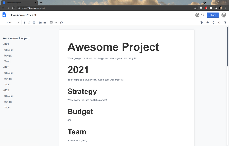
So imagine you're looking at your favourite collaborative doc, perhaps you are planning a project with several others, and it looks something like this:
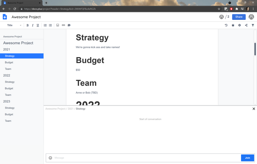
And let's say you want to discuss the strategy for 2021, so you click on the appropriate heading in the Table of Contents sidebar, and then you are presented with this:
As expected, you are moved to the corresponding section in the document, but also a chat interface appears, with a design similar to popular communication platforms like Slack. The Table of Contents becomes a sidebar, and the list of headings becomes a list of channels. So in docs.plus, every time you create a heading in a document, a corresponding chat channel is created.
We think this "docs × slack" UX pattern is very intuitive and compelling. You can try a functional prototype at docs.plus/project; in the meantime, we're busy firming up the rest of the expected functionality - notifications, emoji reacts, mobile experience, everything you'd expect.
Document Filters
We have observed that as a multi-author document grows larger and more complex, it naturally develops an internally consistent semantic architecture based on its headings / section hierarchy. This is made to help its community of authors navigate it and understand the state and meaning of the content as it changes. In other words, it is structured to be understood not only by its intended audience of readers, but also by current and future co-authors.
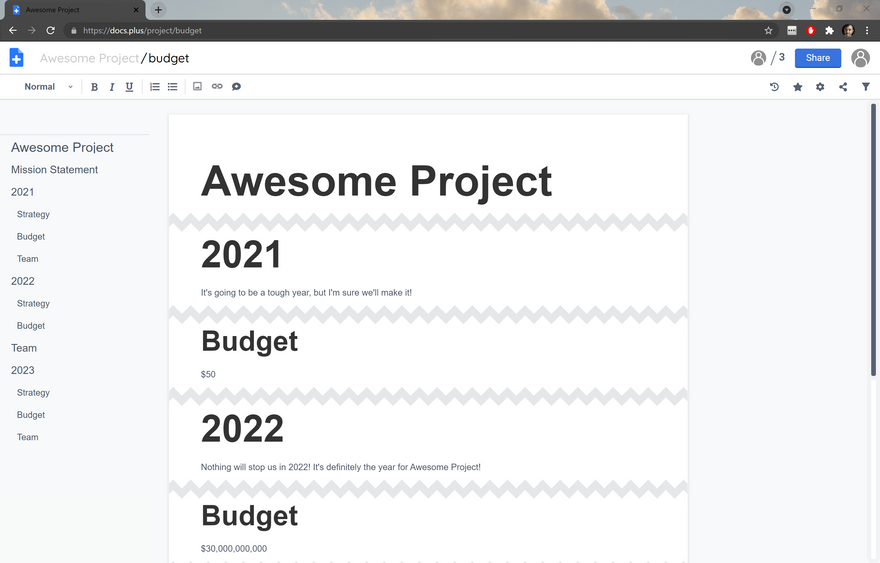
This is a fancy way of saying that people tend to use headings properly! And we can do some clever things with this. Let's say you are working on this project document https://docs.plus/project, but you only care about the budgets. You can create a "document filter", either through the GUI or by editing the URL (https://docs.plus/project/budget), which shows you a view that hides all the parts of the documents that aren't related to budgets, as determined by the headings:
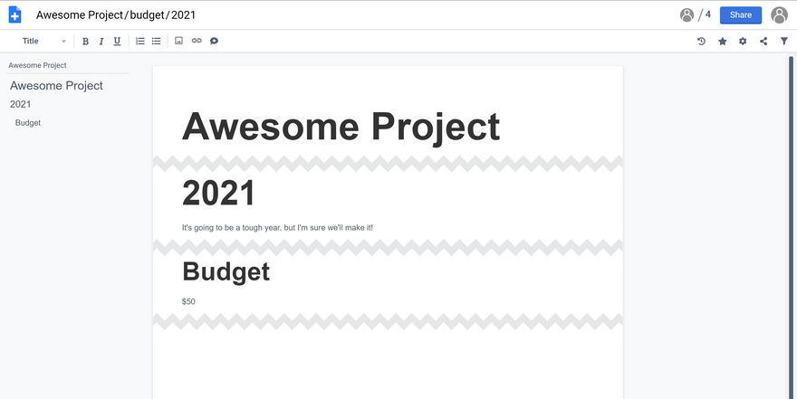
The document is still live and editable in this view, and the hierarchy is respected so you can see which budgets you're looking at. The fact that these exist at a legible URL means views are easy to share and collaborate on. You can even apply multiple filters at once, e.g. https://docs.plus/project/budget/2021
There are many ways to use this. We believe this functionality is particularly important for community documents, because it means users with different but overlapping interests can inhabit and maintain the same space. It also means you can better avoid the problem of communities splitting up as they grow or change. Remember, with the new chat UI it can also take the place of Slack, as well as acting as a document repository.
What next for docs.plus?
We are continuing to polish these new features so that docs.plus is stable enough to be used. We're keen to have communities of people to test it out - if you're interested, do get in touch! ed@newspeak.house or @edsaperia
This is a non-profit open source project, so if you'd like to see it continue please consider supporting us on Patreon: patreon.com/docsplus



Top comments (0)