Project Update
The goal of my project, “Surfacing Harmful Design Problems”, which you can read more about here, is focused on surfacing a particular type of design that harms, deceives, manipulates, tricks or damages users, but specifically in financial services, banking, money lending and money transmitting apps. These types of design patterns are often called dark patterns, or deceptive design patterns, but I will be referring to them as harmful design patterns. In a much longer paper and article that I will be producing at the end of my ambassadorship, I will get into the nuances of harmful design patterns but I will do my best to summarize them in the next few paragraphs.
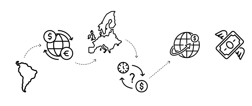
At present, I have been analyzing a series of different types of products and apps in the financial services ecosystem, including different types of money lending, money transmitting, traditional banking apps, and different types of wallets (cryptocurrencies, phone wallets, and finetech platforms like MoCaFi who can function as a ‘wallet’ to distribute benefits like SNAP and EBT in the US). I will dive into this in more detail below, but I have also interviewed experts including policymakers, researchers and technologists, conducted stakeholder interviews, crafted a list of individuals to interview and observe their banking habits (the list is already put together and the interview questions are already written), and I have conducted an extensive literature review.
What Are Harmful Design Patterns?
For background and context, I (Caroline Sinders) am a human rights defender and researcher, as well as a critical designer. I make art, design interventions, and data visualization alongside conducting mixed methods research focusing on technology, policy, and human rights. Design is an integral part of a technology stack; design is the ‘thing’ that often is explaining or visualizing to users how a product or a piece of technology “works.” Design is the medium where user research, product strategy and business strategy all convene; design is powerful. Design can be a truthful narrator, as often as it can be a misleading one. Only recently has design’s role in technology become understood in policy spaces, with the rise of academic, journalistic, and advocacy research on harmful design patterns (e.g. dark patterns), and how they harm consumers, users, culture, and society. The majority of harmful design patterns research focuses on e-commerce related harms, often documenting subscription traps where it’s difficult or impossible for a user to end a subscription, sneaking items a user did not select into their shopping basket, false urgency or scarcity claims to nudge a user to buy a product NOW, and many others. However, harmful design partners can be broken into typologies and taxonomies that can be applied to other domains outside of e-commerce. For example, in a paper I co-wrote as a post-doctoral fellow with the UK’s data protection and privacy regulator, the Information Commissioner’s Office, we illustrated how harmful nudges and sludges impact privacy choices consumers can make and are present in a variety of product flows, including cookie banners, and interstitials where users are setting up their accounts for the first time. For example, as we argued in our paper that “..harmful nudges” (also called “dark nudges”) are when a firm makes it easy – or “nudges” – users to make inadvertent or ill-considered decisions… When harmful nudge or sludge techniques are used, consumers may make choices they wouldn’t otherwise have made and that do not align with their best interests or preferences. For example, it could lead consumers to select less privacy-enhancing choices when personalising their privacy settings or make it hard to change their privacy settings.” But harmful nudges can be found in all kinds of apps and products, including financial services products and this is what I’m currently documenting.
Some of the harms I’ve started to surface have been well documented in the financial services space, but not necessarily documented as ‘harmful design problems’ of which they can be, and these are problems that are not well known to consumers, particular consumers newer to finance and financial services, which is who my project focuses on. Specifically, there’s a suite of money lending or holding apps that services that report to be free, but have hidden costs, and those hidden costs when not articulated to users, can be a harmful design pattern. In other cases, money transmitter services or ‘financial technology platforms’ can look and feel like a traditional bank to a consumer, because they can issue a debit card to the consumer, but are not a traditional bank. In essence, the lack of a disclosure or clarification, is a harmful design pattern.
This project also addresses the role of friction in design and in banking and financial services; friction can be a nuisance to users but an important protective element for companies. Context matters here, because friction can amplify a harmful design pattern, while friction in a different type of product can be a key user experience decision.
Progress on Objectives, Key Activities
I have conducted an extensive literature review, along with using open source investigative techniques to source and scrap the internet (App/Play stores reviews, review forums Twitter, Reddit,, and other forums and blogs) for customer complaints with the different apps I’m focusing on. I have also interviewed a series of experts, from former Consumer Financial Protection Bureau researchers, Better Business Bureau researchers, to policy experts, harmful design patterns experts, and conducted a series of stakeholder interviews. I have also put together a comprehensive list of vetted individuals (15 in total) to interview and observe how they use different banking and financial products, and a series of questions on their thoughts about banking and digital financial inclusion. All of these individuals are immigrants in the US, UK or EU, and 13 of the 15 individuals are from India, Colombia, Chile or Iran. All of the individuals are sending and receiving money from different countries; usually, they are receiving money into their bank account in the country they currently reside, and are then sending/receiving money back home, and then are often sending/receiving money from another country because all of these individuals are freelancers or run very small businesses. None of these individuals have a background in finance, and most don’t have parents, family members or mentors to guide them on topics related to digital financial inclusion, such as how to invest their money or create savings plans.
As I stated above, some of the harms I’ve started to surface have been well documented in the financial services space, but not necessarily documented as ‘harmful design problems’. But by contextualizing these harms as ‘harmful design patterns’, it can be possible to use new forms of regulation, such as the Digital Services Act, where harmful design patterns are explicitly mentioned, to better combat these harms. But additionally, by naming these harms as ‘harmful design patterns,’ we can better understand the role that product design plays in these harms, and provide solutions and suggestions so other financial services companies can avoid these harms.
Harmful Design Versus “Friction” or Annoying Design
This project is looking at all different types of digital products related to financial services, like cryptowallets, traditional banks, money lending apps, and money sending apps. But it’s important to clarify that some of the design issues I’m surfacing are issues that are not harmful design patterns, but issues related to poor user experience design, where a user encounters more friction than they are used to or design choices that annoy them. While I have surfaced harmful design pattern examples, those are described in more detail below. But in my stakeholder interviews, and in my own personal experience, which has become a part of this project as I have just moved from the UK to the US, I have noticed frustrating design patterns in the different banking and financial service platform apps that I am personally using, and that the stakeholders are using. While the core of these frustrating patterns might be related to fraud prevention, payment sender/recipient verification, and a variety of other consumer protections, the way that these patterns are presented to users continues to be frustrating.
Understanding Friction: How it Can Be Good and Bad Design
Friction happens, in all different types of ways and across all different parts of an app. Take, for example, my partner trying to pay our rent when using a traditional bank, Chase Bank, that he just signed up for in the US. “I just want to know why Chase bank is slower at sending money than HSBC UK” my partner exasperatedly exclaimed. Our rent payment was delayed; apparently, the recurring payment he had set up in Zelle had failed yet again. I tentatively asked, “Why don’t you use Chase’s bank transfer?” My partner deeply sighed and said, “I tried using it, it required all of these steps to verify myself and the landlord, and it still failed. I had to physically go into Chase Bank, speak to a person, and then they showed me somewhere hidden in the app some feature to turn on or off.” I asked what happened after that and apparently the payment failed again, so my partner decided to use Zelle. But even Zelle is frustrating, as there are daily limits and it takes two days (or two Zelle payments) to fully send our rent money to the landlord. In this context, my partner was missing the ease of use of our UK banks, HSBC UK and Starling UK, to send money and send recurring, verified payments.
In that moment, I realized what my partner was describing could be friction, and ‘poor design’ of the app, but maybe not a harmful design pattern (a harmful design pattern generally is nudging the user to do something that benefits the company and not the user, and that doesn’t seem to be the case with my partner). I am currently in the process of trying to find the setting my partner mentioned in the Chase Bank app, and I will blog about this in the future once I learn more. But, regardless, this raised the issue of friction. Friction is a part of design, it can be both good and bad, but it depends upon the context. This nuance of friction was echoed by Harry Brignull, the discoverer of harmful design patterns. In an expert interview for this project, Brignull described helpful versions of frictions in our conversation. He elucidated, “Fire alarms in public buildings sometimes have flip-up covers, so they don’t get pressed accidentally. Medicine bottles often have child-proof caps, to ensure they are opened responsibly. This is constructive use of friction, where you’ve got harmony between the business provider and the end user. Everyone’s happy. Designers can do the same thing online too. For example, creating a repository of code on the Github platform might involve weeks or months of work. So when you try to delete it, Github makes sure that you’re certain of your choice by requiring you to enter the full name of your repository in a text field before they’ll let you proceed. If you’re in a hurry this can be a bit frustrating, but they’re doing you a favour for that one time when you realise that you’re making a mistake and you back out before it’s too late.”
Friction can be a warning signal, a way to get users to reverify and double check information, and also consent. This type of ‘pro user’ or consent focused friction can be applied to environments where consent deeply matters, and in highly regulated industries, like banking, where the company wants to double and triple check that a user is sending the right information to the right recipient. Design is doing a lot of heavy lifting here, by introducing friction to ensure consent and give the user space to double check information, while also having to explain how a system works, as seen in money sending design flows.
However, friction can also be weaponized. Brignull explained, “Cognitive friction isn’t inherently good or bad. It’s a characteristic of the medium that designers learn to work with. A lazy designer might add friction by mistake; a helpful designer might remove friction to assist users—so they can get the job done faster; or add it in some cases —to get them to stop and think about critical decisions so they don’t act rashly; and finally a manipulative designer might add friction to discourage unprofitable actions, like increasing privacy settings or cancelling subscriptions.” Understanding the differences of friction is deeply important, and recognizing that kind of friction is deeply important, slowing down a user to really make sure and verify the information they’ve submitted, and ensure they are aware of the risks of clicking confirm.
However, this type of friction that slows a user down to protect the user and the company is different from other types of friction I’ve noticed in traditional banking apps in which it’s difficult to surface certain settings, or not understanding why it takes longer for a payment to be sent via bank transfer versus Zelle. I would not label any friction that is around confirmation of sending money a harmful design pattern but I am also not sure that I would label the other examples I’ve given as harmful design patterns, either. There are differences between ‘poor’ design or ‘bad design’ versus harmful design patterns; harmful design often nudges, confuses or manipulates the user into making a decision they normally wouldn’t make. An app that hides fees, or tricks a user into paying more for something than they should would be examples of harmful design patterns. Having UI, logos, or color choices that feel out of date might be ‘bad’ design’ but that doesn’t make it a harmful design pattern. Burying a necessary setting, depending upon what that setting is, could be a harmful design pattern. Like friction, it all depends upon the context.
Good friction is asking for confirmation on sending money to a particular recipient, and verifying customers- we need that friction. But there is bad friction, and it can be found in how an app layouts its accounts, where it buries the functionality to send money, and when it doesn’t include easily surfaceable explanations. For example, in some of my screenings of user interviews, one potential interviewee mentioned how difficult it was to transfer money over from her traditional bank in Chile to a UK bank account. Her Chilean bank account didn’t tell her how much the transfer or conversion would be, and how long it would take; she needed a very precise amount of money to land in her UK account and had just enough to meet that threshold. But not knowing what conversion rate her Chilean bank was using or what fees she’d incur with the transfer, alongside not knowing when the transfer would be complete, caused incredible stress for her. She mentioned how other banks (that are more money transmitters) would tell her the conversion rate and costs upfront, and how those apps made it easier to access explanations through carrot tops and pop ups that she could easily swipe out of, and not be taken out of the entire money sending process. This is a story similar to what I’ve heard with other immigrant workers I’ve been speaking to in the US, UK and EU. There’s unnecessary friction in a lot of traditional banking apps especially in sending money internationally– but by better laying out those apps, and making it easier to send, and receive money such as including helpful information (like what the total amount of money the recipient is sending), and how long it will take to transfer– would improve the overall user experience. Other stakeholders stressed just how difficult it can be to talk to a human customer service representative, or access updated FAQs with traditional banks to troubleshoot solving a problem especially when out of the country; while that’s not design related per se, it is a user experience issue financial service companies should solve. There’s a myriad of improvements that traditional banks but all financial services companies could undertake– but I’ll leave that for my final report! ;)
Harmful Design Patterns in Money Lending Apps
However, there are examples of harmful design patterns in financial services apps. In my project, I have been analyzing a suite of money lending or holding apps generally, including Nerd Wallet, SoLo, SoFi, MoCaFi, Albert, Dave, Bridgit, and a variety of others. In order to really understand the ecosystem of financial services, it meant that the design analysis I conducted should take into account a variety of types of money sending, money lending and financial technology platforms to truly understand the ecosystem. Relatedly, I was interested in apps that had multiple functions (allow for money deposits and loans, for example), and also apps that purportedly marketed helping the user at free or no cost. These two additional metrics lead me to money lending/short term loan apps, and money planning apps (focusing on how to save, budgets, etc). Within that, I noticed that some money lending apps also are expanding to allow users to deposit and receive money, including paychecks, and these types of products were one that a former CFPB employee highlighted as a suite of products they were also concerned about, as well.
Please note:my research is still ongoing and I don’t want to misspeak on active research, some of these apps (BUT NOT ALL) have some services that are problematic including misrepresenting fees (often portraying themselves as free services but there are hidden costs on the user), and misleading consumers to give or donate money to individuals on the app, and a variety of other harms. For example, in 2024 the CFPB has brought about a complaint against SoLo Funds for misleading consumers on ‘free’ no interest loans when in fact there are hidden fees and that SoLo Funds has a pre-selected tip jar with no options for zero tipping, which is an explicit harmful design pattern in my professional opinion. While the new acting director of the CFPB, appointed under President Trump, has dismissed its enforcement action against SoLo Funds, I believe this still serves as an example of the type of harm and confusion a harmful design pattern can enact on users. How fees are presented, or not, deeply matters, especially for consumers who live paycheck to paycheck. An additional $10 or $20 dollars as a fee will directly harm that consumer.
While SoLo is just one of the apps I’m focusing on, other apps like Nerd Wallet received multiple complaints on trustpilot.com with users saying they had been marketed a specific credit card rate only to have been awarded another one or being promised a service, like comparing companies, only to be funneled to company partners of Nerd Wallet. Depending upon how these services were presented to Nerd Wallet’s users, these examples could very well be harmful design patterns. Other apps I’m analyzing like MoCaFi have numerous complaints from consumers to the Better Business Bureau and on trustpilot.com citing delays in receiving MoCaFi debit cards, fraudulent charges, inability to contact customer service and a myriad of other charges. Given MoCaFi's stated mission to serve underbanked communities, this makes the design flaws in their products and services all the more damaging. It is senior citizens, disabled individuals, and low-income users receiving government assistance funds who are often the ones mentioned in or writing the MoCaFi complaints.
What impact does the project have on your perception of digital financial inclusion?
Design is what all consumers engage with– and for a lot of products, it's often what explains what a product is doing, how the product works, and what the product’s policies are. The users I am in the process of interviewing are all new to financial inclusion and understanding financial products.
My interviewees and stakeholders are younger and more marginalized consumers, who might not be a traditional bank’s key audience or an audience a traditional bank cares about, but these users have user needs and expectations. They have to use banking because they live in modern society, but they also live lives stretching across oceans and continents, and they have to send money across different countries and jurisdictions. Any issues or confusions they have with international money transfers have large implications, especially when a lot of the interviewees live paycheck to paycheck. A delayed paycheck means the rent is delayed, and means that there is not enough money for groceries, electricity, the internet, and all of the things they need to survive. An unforeseen or unexpected charge impacts their day to day and monthly finances. These users want more clarity around international money sending, and they also expect more ‘dynamic design’ (animations, logos, explanations) and also products that are designed mobile first.
Even if financial services and traditional banking apps don’t have harmful design patterns, their current designs can still alienate consumers with a lack of easily surfaceable explanations, difficult to use mobile apps, poor customer service that can be accessed abroad and many other issues, on top of established practices that make it harder for individuals to access banking, or change elements of their bank accounts (as explained further below).
Additionally in this work, I noticed an emergent harmful design pattern. In stakeholder interviews, I’ve noticed there’s a confusion over what constitutes a new ‘bank’. Meaning, stakeholders are using traditional banks, money transmitter services and/or ‘financial technology platforms’; the money transmitter services and financial technology platforms can look and feel like a traditional bank to a consumer, because they can issue a debit card to the consumer, but they are not technically traditional banks. This confusion has real world implications for users. In essence, I believe this explicit lack of a disclosure or clarification, especially in the product’s app and in its website, is an emergent harmful design pattern and must be treated as such particularly in financial services. While I am still conducting research, an initial suggestion I have is that: the products and companies should articulate what the limitations of the product is, how it can and cannot protect users particularly in comparison to traditional banks, and this information should not be hidden away in difficult to find FAQs or in the terms of service. This type of information should be clear, concise, and presented to users repeatedly throughout the product’s app, and websites. I’d love to brainstorm more with the Interledger Community on thinking about how to design this recommendation I’ve suggested above.
Project Impact & Target Audience(s)
To analyze design, it’s not just focusing on the graphical user interface, but it’s also focusing on the knowledge an app assumes a user does and does not have, and the greater systems both the product and user exist in. Take, for example, one of my stakeholders who was going through a separation and tried to remove their partner from their bank account. Anyone who has gone through a separation knows how difficult it is to untangle combined accounts. Other stakeholders I’ve spoken to have talked about the difficulty when removing legal spouses from accounts. One of my stakeholders spoke about the frustration of this whole ordeal and that the only quick solution at the time would have been to create a brand new account. But this difficulty and legal document filled design pattern has wider implications, especially for victims of domestic violence. In these scenarios, it makes it easier for one partner to engage in financial abuse against the other partner, like emptying the account, or closely surveilling payments. I know there’s good, specific legal reasons for why the structure is the way it is, but I offer these examples to say that when customers of these banks are experiencing some of the most harrowing and traumatic events in their lives, navigating opaque and complicated systems increases that trauma. This is much of a design ‘flaw’ as it is a policy one, because how the systems are designed for customers to navigate within are designed, and that design is constrained by policy. I can’t offer a better legal or design suggestion here, but what I can do is highlight how some of these systems make it very difficult for people in unimaginable situations to move forward.
Design includes all of these systems and contexts, and users deserve to be protected, while using banking apps. There needs to be a shift towards aiming for good, explanatory design (and that still includes the right kind of friction). Good design isn’t just a “nice to have”, it is a requirement for digital financial inclusion. Good design doesn’t just refer to the absence of harmful design patterns but it’s thinking through what positive nudges are beneficial to users, especially users who are newer to finance and financial services. Having “good design”, like better explaining processes using plain language and laying out web apps to increase usability for all audiences, are also design suggestions that improve an app's accessibility for disabled users, too. Design is political, and design is a tool to better improve digital financial inclusion.
Communications and Marketing
I’ve been discussing this project within the research phase, which I’m nearly finished with, and I’ve been discussing with policymakers, designers, technologists, and journalists. But I am in the process of pitching two public facing journalism articles about this work, and in the process of being interviewed for a podcast on my harmful design patterns work, which I’m excited about!
But, I'd love any help sharing the findings at the end of the project, as well as any help on amplifying a few of the related outputs that are in the pipeline. I am currently working on a Salon episode for my project, as well as pitching one or two short articles about the project to different publications and working on my longer, interactive article.
In tandem, I am creating a workshop to share the findings with policymakers, civil society organizations, designers and technologists which will help disseminate the findings and support wider conversations on harmful design patterns.
I’ve also had numerous one on one conversations throughout my ambassadorship with lawyers, consumer protection advocates, current and previous staff of regulators, and established scholars. The participants of these conversations have vocalized interest in the project and its findings. I will continue these conversations and initiatives to further disseminate findings from the project, and ensure its impact. This could include speaking engagements at conferences, social media posts, articles, and conversations with relevant stakeholders.
What's Next?
My next steps are to run a series of experiments with some of the money lending apps I’ve been analyzing, interview and observe individuals for research (this will be finished in the next two weeks), craft a workshop on my findings, and write an interactive article. Additionally, I am coordinating with different members of the Interledger Foundation’s staff on potential related events.
Community Support
I’d still love to speak with members of the community, and share findings that I have. For example, I have some thoughts on what is a harmful design pattern in some of the traditional banking apps I’ve analyzed- and I’d love to get feedback ASAP on that from any community members. If anyone is interested in having a conversation, please let me know! If folks are interested, I can also make a public workshop for community members to attend :)
Additional Comments
I’ll be at the Global Gathering in September with some of the Interledger Foundation Staff, and I will be at the Interledger Summit in November. If you're there, I’d love to say hi!
As for other work, I recently co-authored a complaint on harmful design patterns to the European Commission; this was collaborative work done with EDRi and Bits of Freedom.
Top comments (2)
Hi @carolinesinders, Thank you so much for writing this extensive progress report!
It truly enjoyed reading it
awww ty! i'm glad you enjoyed it :)