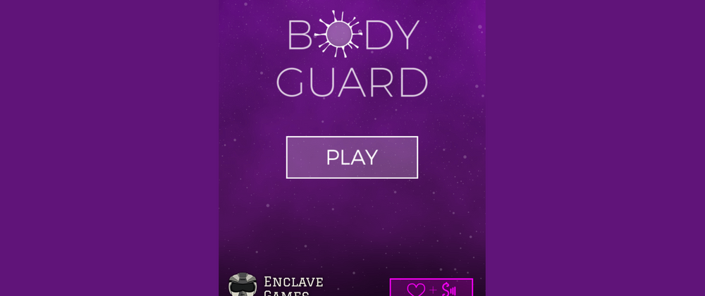
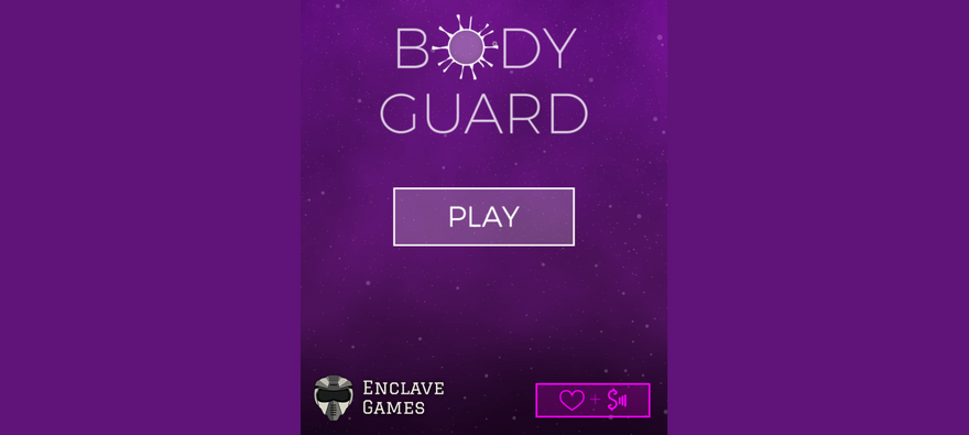
This is something we were discussing within Enclave Games many times in the past, and now would like to ask YOU and see what your opinion on the topic is: should the Web Monetization / Coil branding be kept strict and original, or adjusted to the visuals of the game?
On one side, there are brand guidelines which you should follow - you can't just do whatever you want and modify the logo however you like. There are strict guidelines and they are written for a reason. On the other side though, integrating such iconography into the game's experience visually makes it more tied to it, and usually just looks better and more natural.
For us it feels like adjusting the look to fit the theme is the way to go, but it can't go too far, where "too far" is a subjective, case-by-case feeling.
What are YOUR thoughts on this? Let's discuss!


Top comments (8)
Great question! I think its ok, especially if every attempt is made to use the style guide as inspiration. I also think when possible discussing with the brand owner and seeking collaboration/approval is always a good idea.
Good point - even if you think your variation looks good, some creators/companies might want to stick to their rules whenever the branding is exercised, so asking for permission is definitely a way to go.
In my experience the questions is always better received then the after the fact discovery. Doesn't mean the brand holder green lights all changes b/c you asked but their is an appreciation that drives a willingness to find a solution. Nothing is worse than discovering "They did what to WHAT?" even if the changes are ultimately inoffensive. No one likes feeling left out, not consulted.
Totally agree!
Honestly, I think as long as it's recognizable, it should be okay to adjust to suit the game, website, etc. Obviously for Coil.com, the styled C with the black background is their preferred logo... so if you can keep it the same that would be ideal... but if you had the styled C on a dark purple background that could work.... especially if it was clickable.
I think at the end of the day, companies would rather receive attention than be ignored/not included (unless it was going to hurt their brand)... but as people have already mentioned, I'd always try to run it by the company before releasing to the public.
Agree, extra "free" attention is usually good, as long as it's not ruining the overall image of the given company.
I think you should take it as a case study. You work with a brand lets say Coca Cola. They want you to show their branding. (I worked with brands before in marketing context some very strigent). You as the creator must find a creative way to seamlessly incorporate it without not abidding by their rules.
Yeah, it could depend on the company's approach to such attempts in the past - some will be cool with it, some others might not so much.